


About the project +
Visual Identity
2021
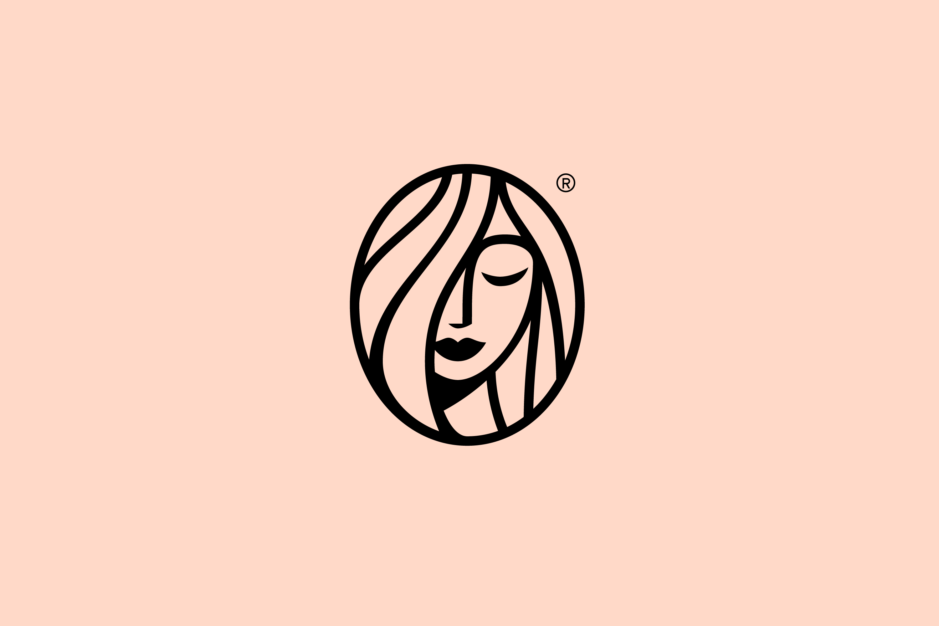
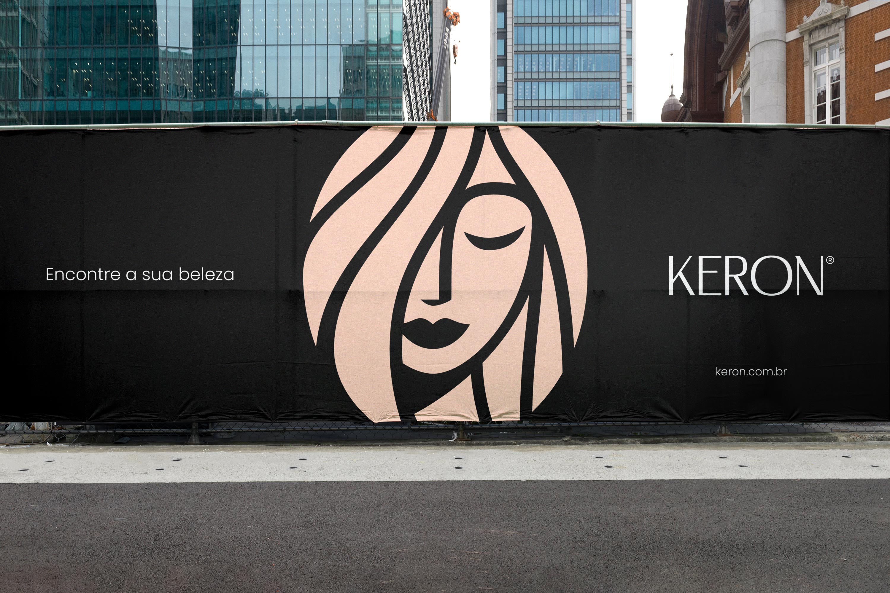
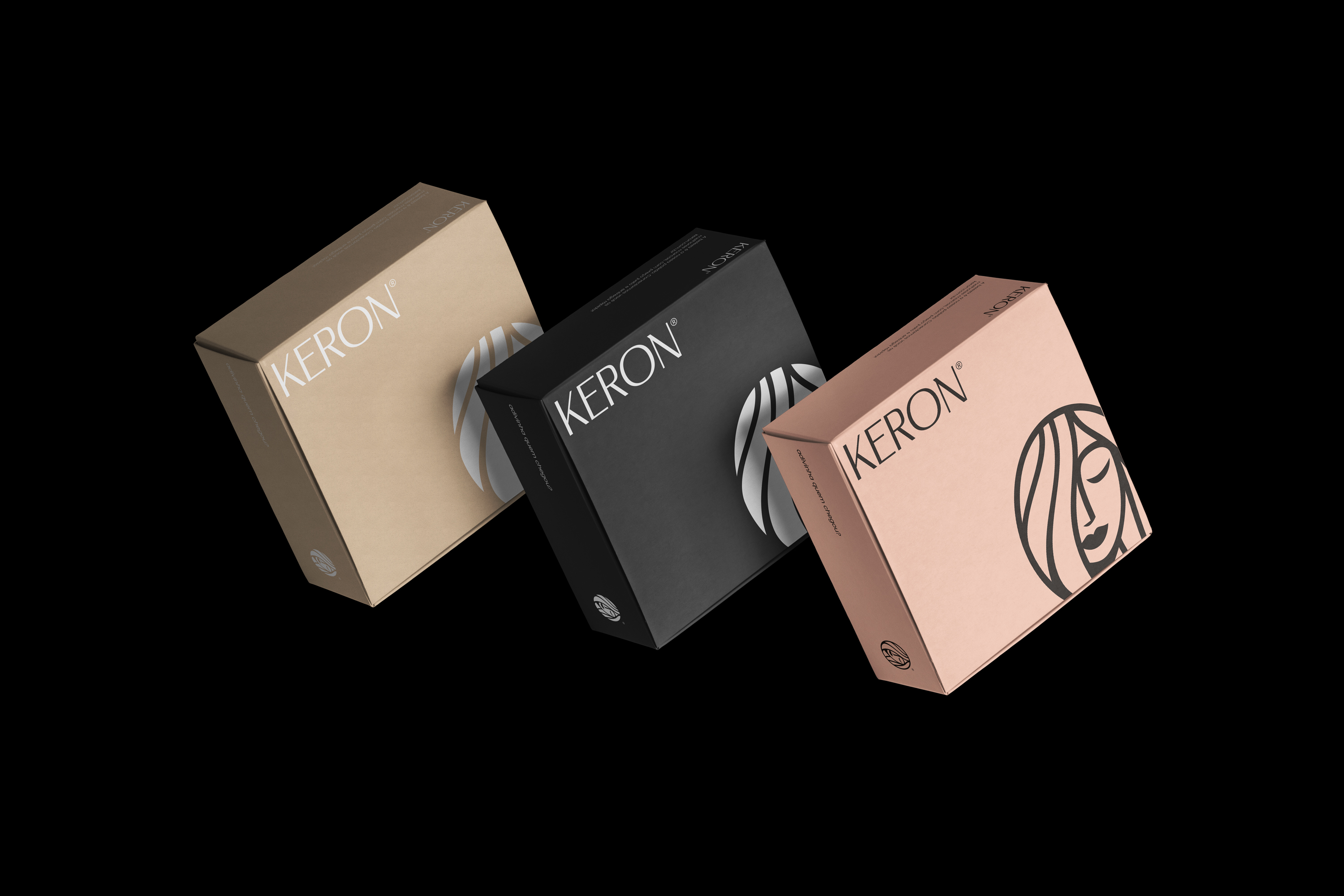
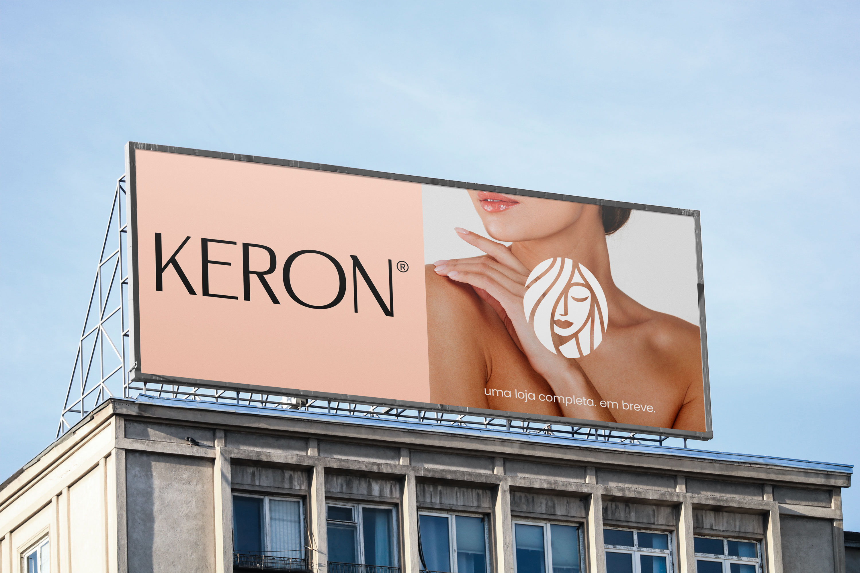
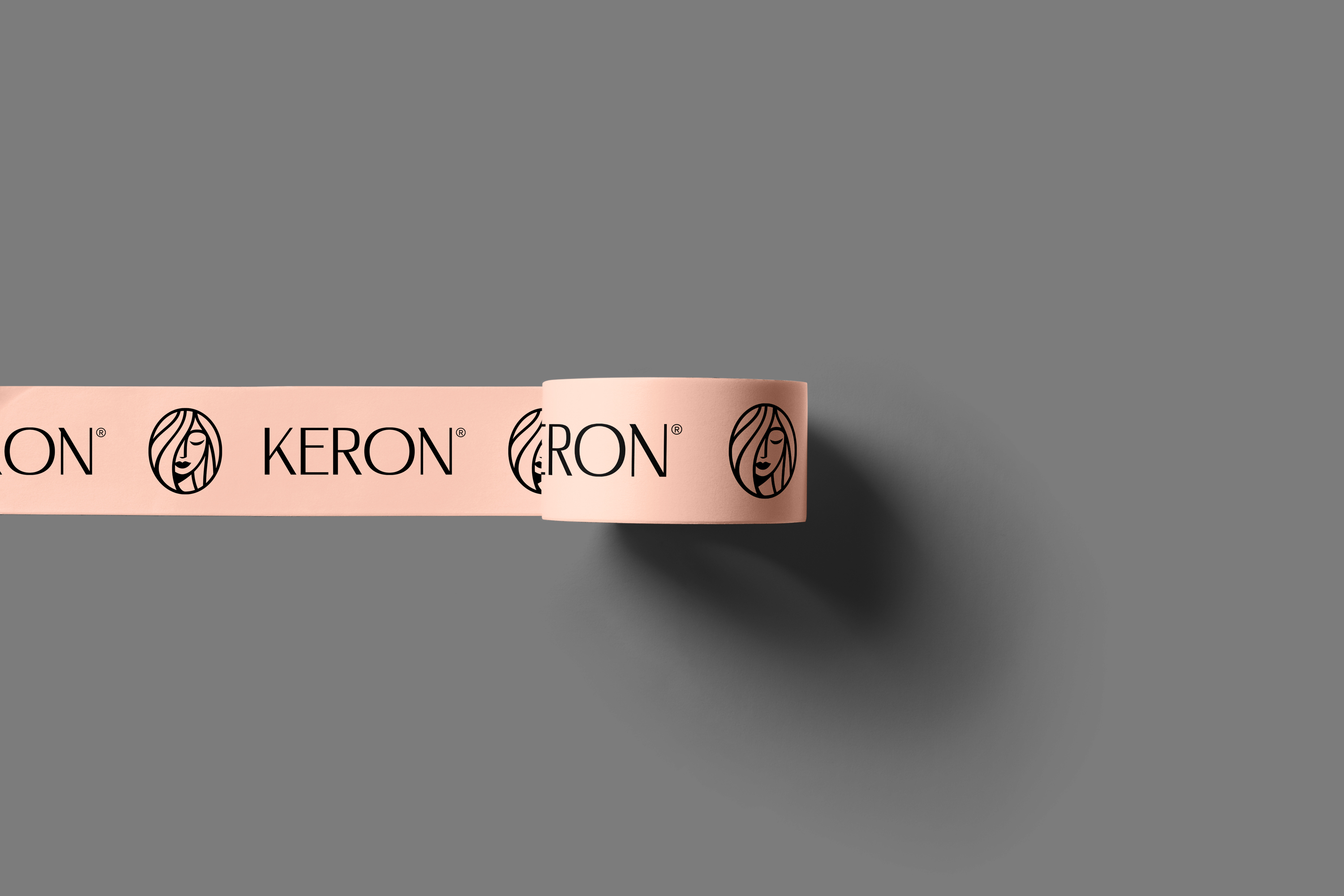
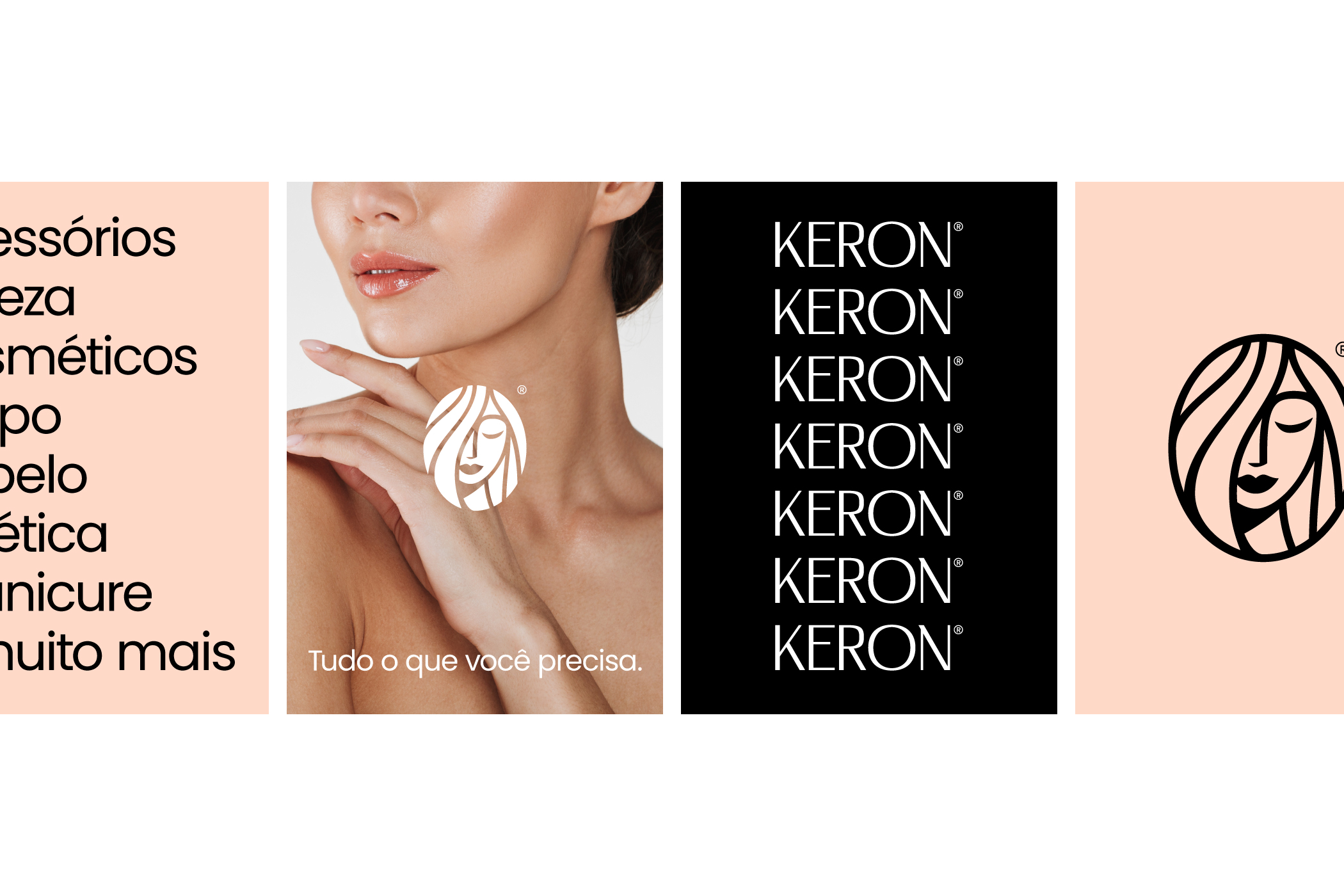
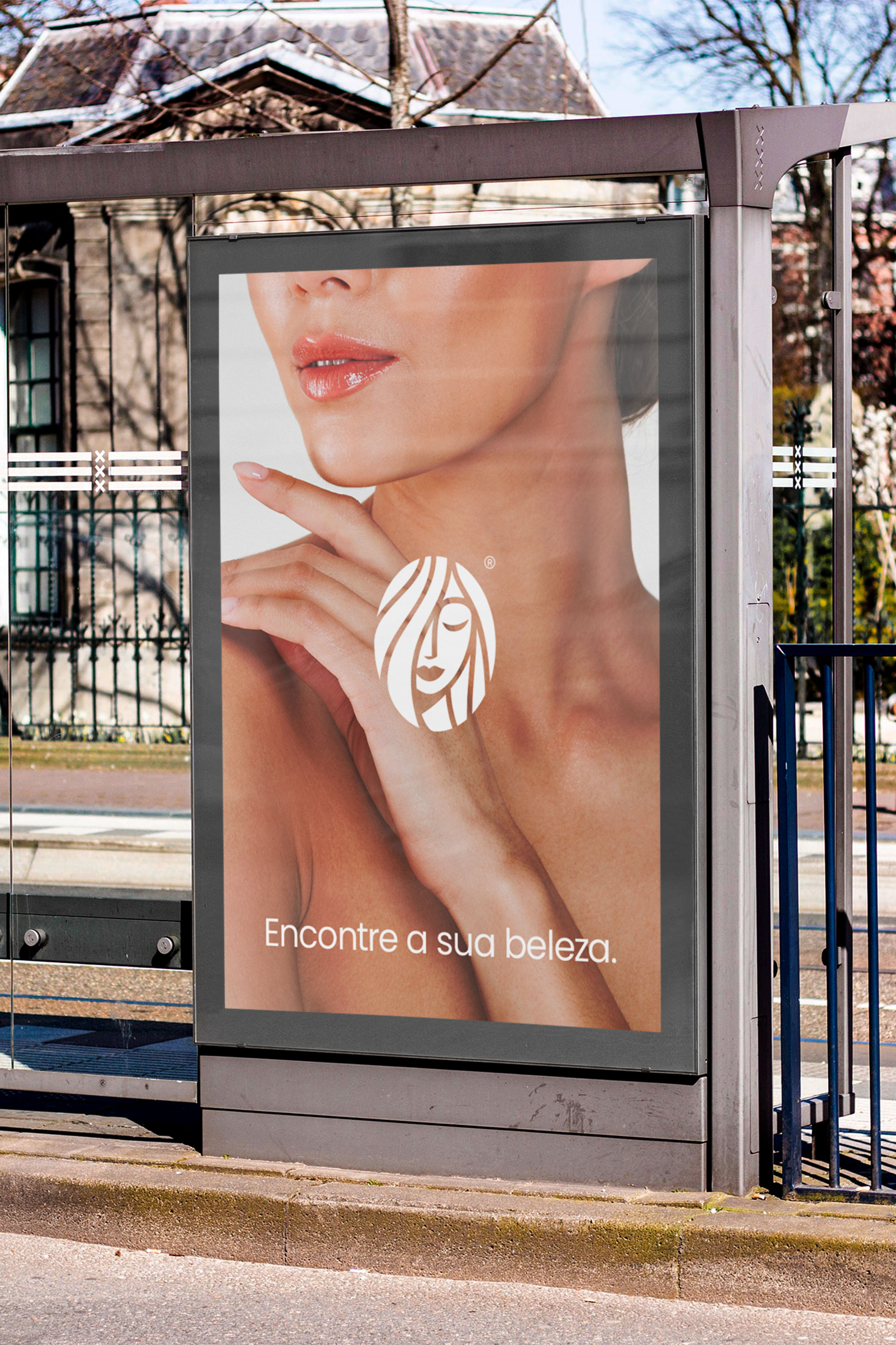
Keron is a passionate beauty brand born with the mission of helping women and beauty professionals find the best products.
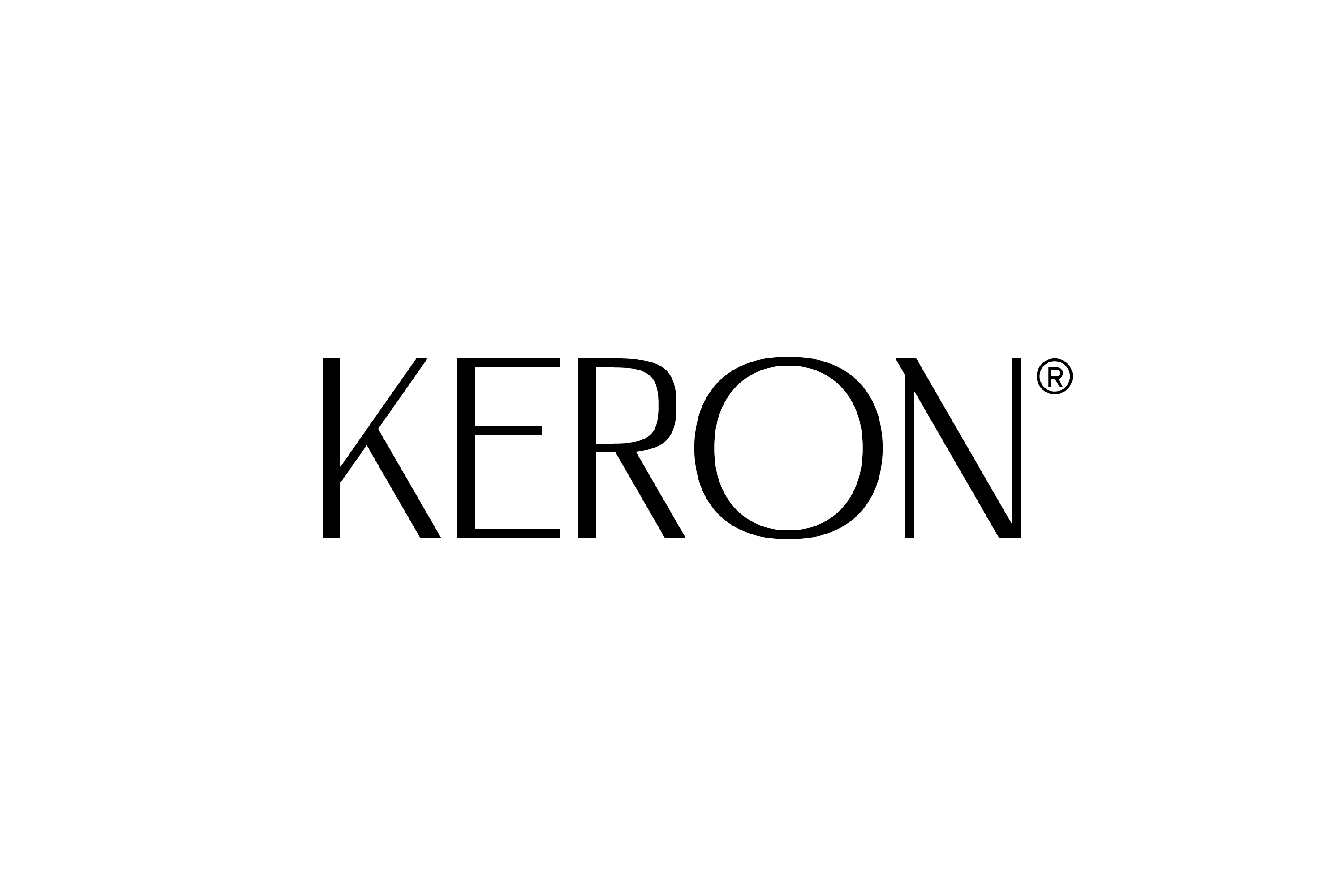
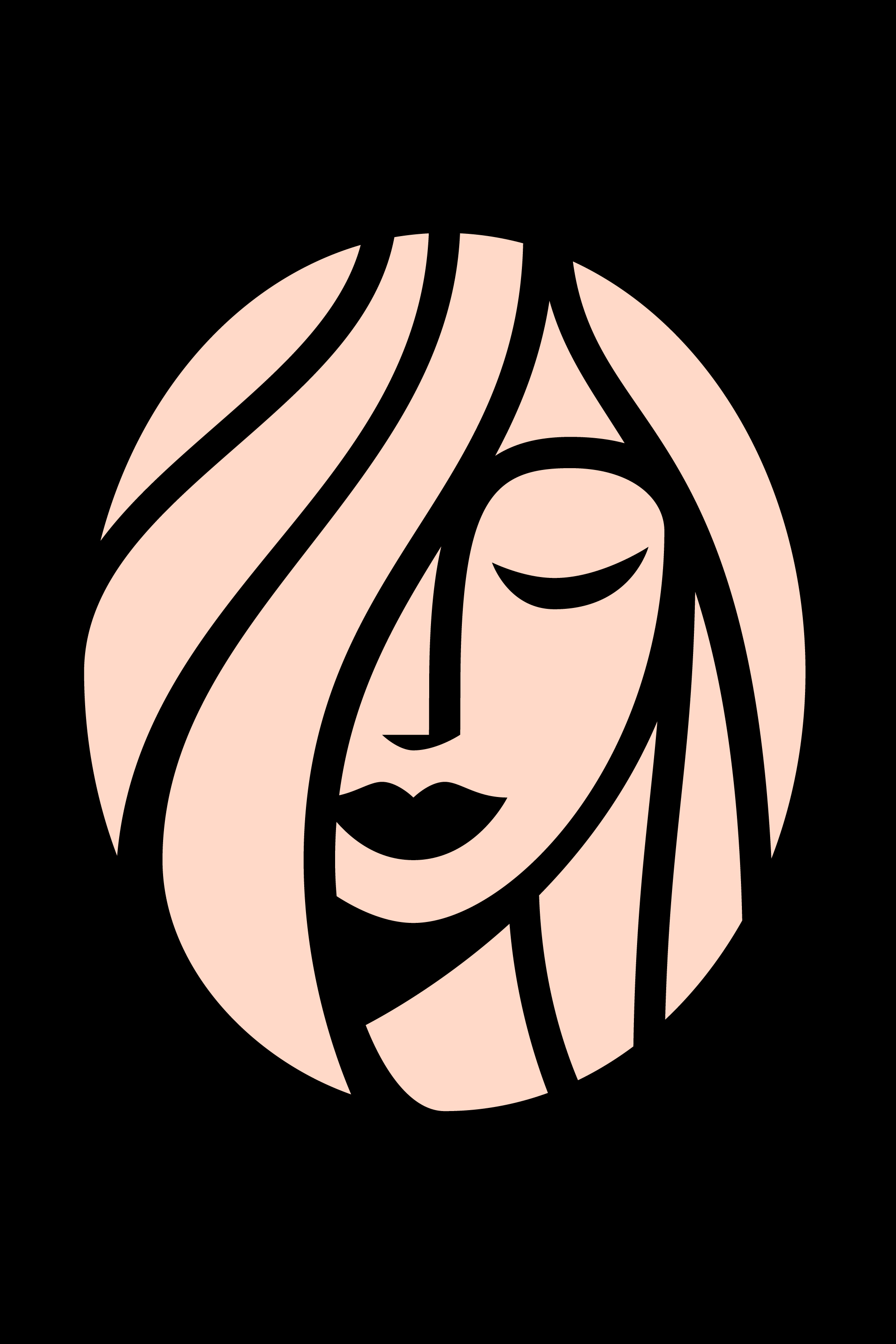
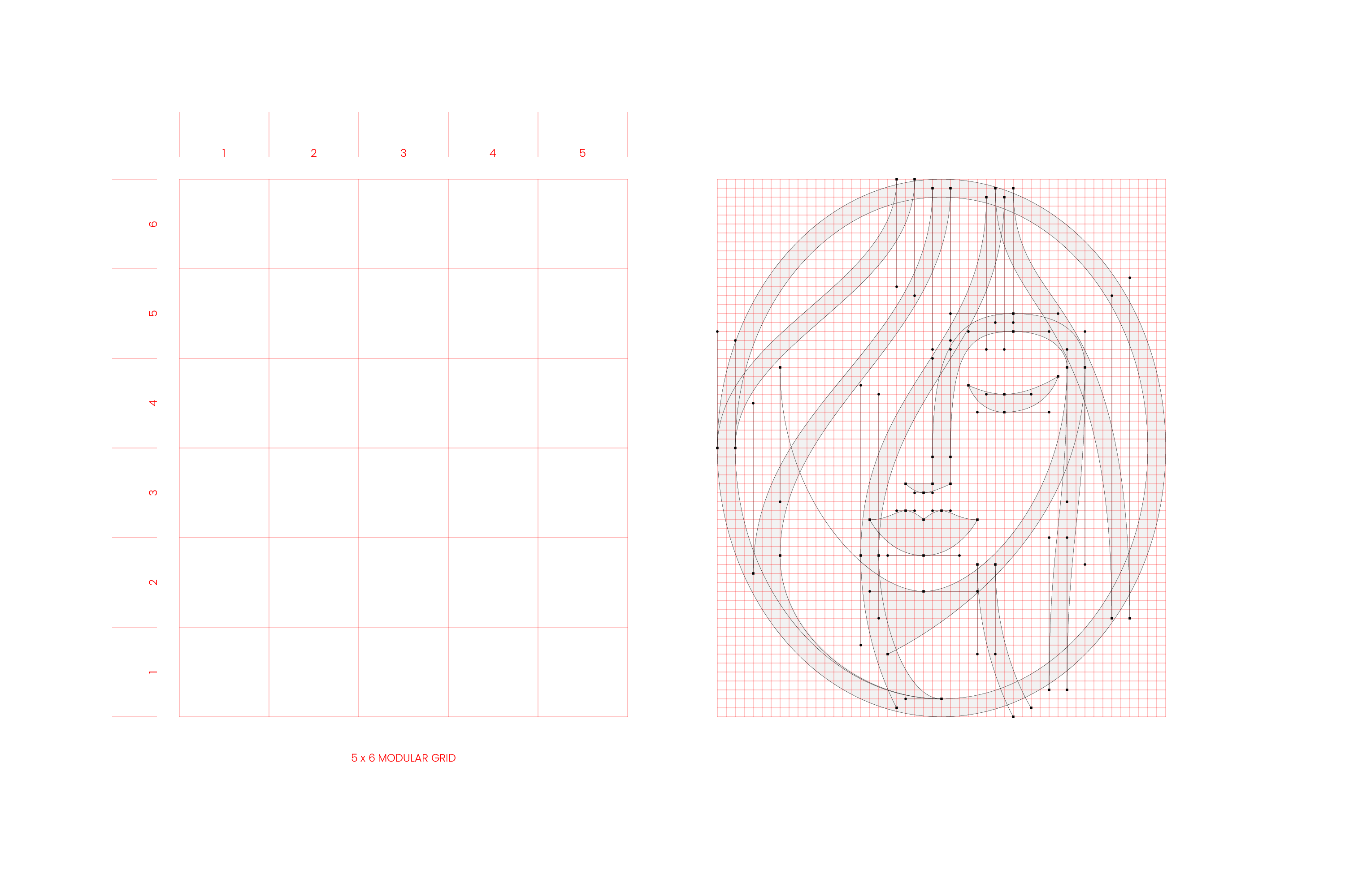
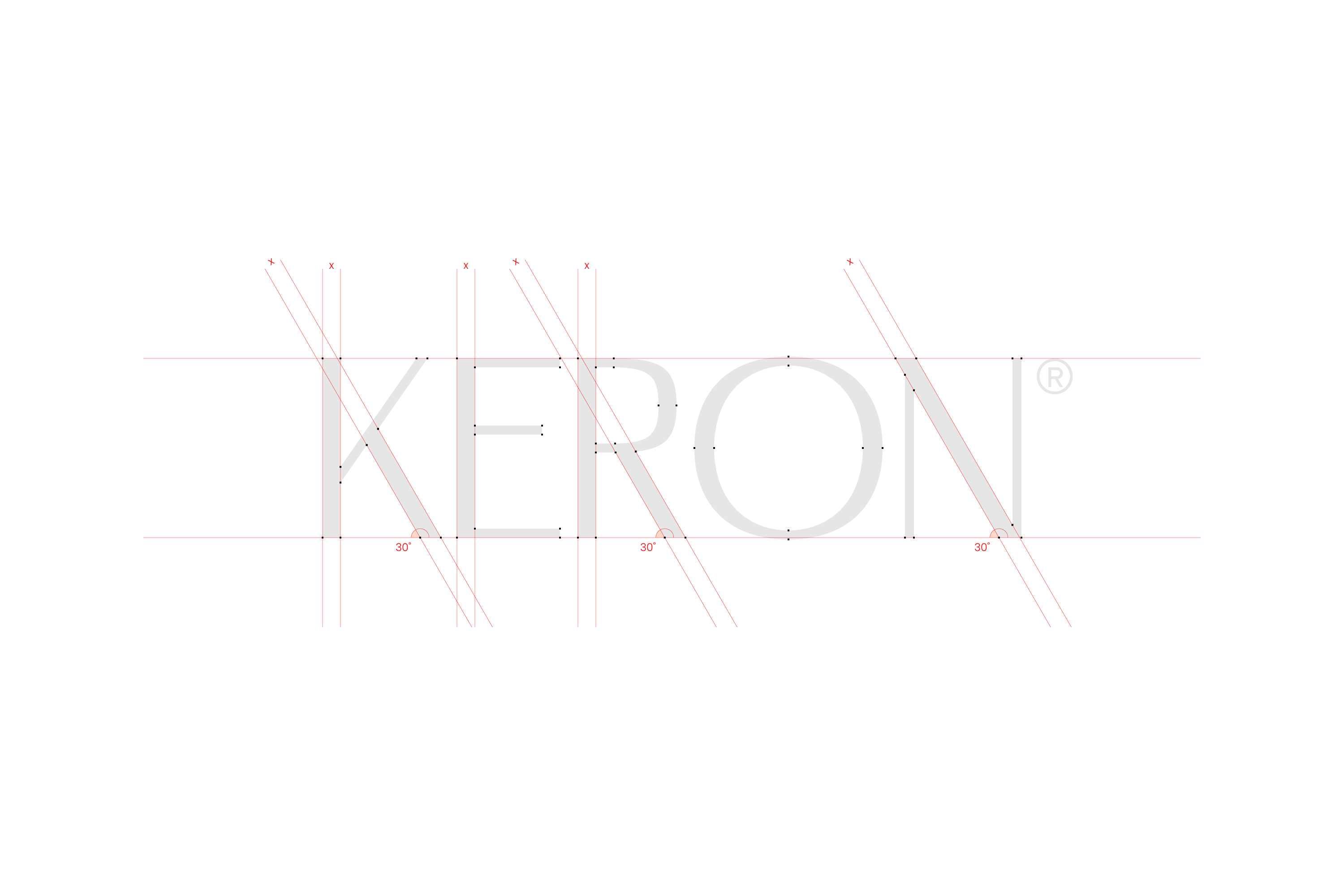
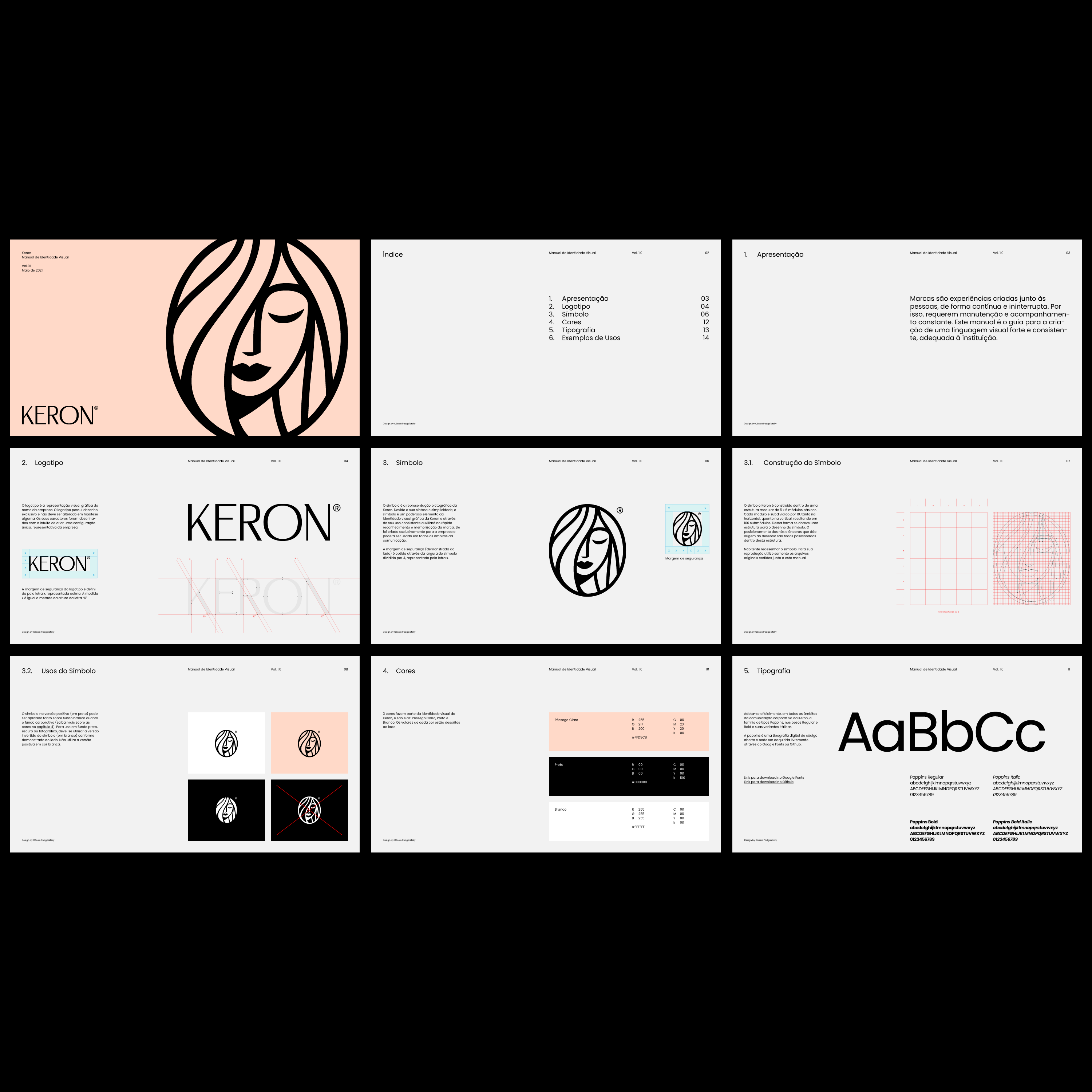
The visual identity created for Keron is simple yet memorable and distinct. It is centered on two elements created exclusively for the project: a logotype and a symbol. The logotype is feminine and imposing yet not pretentious. The symbol is an allusion to the meaning of the name Keron: Goddess. Due to the simplicity and flexibility of the visual identity, the brand will be able to create its own product line in the future.
Let's create something amazing!
Get in touch and let's talk!